Mobile Web Design
The mobile web refers to access to the world wide web, i.e. the use of browser-based Internet services, from a handheld mobile device, such as a smartphone or a feature phone, connected to a mobile network or other wireless network. Traditionally, access to the Web has been via fixed-line services on laptops and desktop computers. However, the Web is becoming more accessible by portable and wireless devices. An early 2010 ITU (International Telecommunication Union) report said that with the current growth rates, web access by people on the go — via laptops and smart mobile devices – is likely to exceed web access from desktop computers within the next five years. The shift to mobile Web access has been accelerating with the rise since 2007 of larger multitouch smartphones, and of multitouch tablet computers since 2010. Both platforms provide better Internet access, screens, and mobile browsers- or application-based user Web experiences than previous generations of mobile devices have done. Web designers may work separately on such pages, or pages may be automatically converted as in Mobile Wikipedia.

The Two Approaches to Creating Mobile Websites:
Approach #1: A Domain of Their Own – Creating a .Mobi Website
.Mobi websites are sites that have been specifically designed to be viewed and navigated on mobile devices. Technically any domain can be viewed on a mobile device, but .mobi sites claim superior usability. From a user perspective, .mobi is preferable since all .mobi sites MUST be optimized for viewing on a mobile device. From a business perspective, there is a solid assortment of both pros and cons in taking the .mobi design route
Pros
- Specifically designed to work well on small mobile screens
- Minimum amounts of bandwidth is used, letting sites load faster
- Simple, light, and streamlined.
- More likely to appear than .com sites on mobile searches
Cons
- You now have two separate websites to maintain (your regular .com domain and .mobi mobile domain)
- You must start SEO work for your .mobi from scratch
- Having two domains means the increased possibility of duplicate content
Approach #2: Go With the Flow – Responsive Web Design
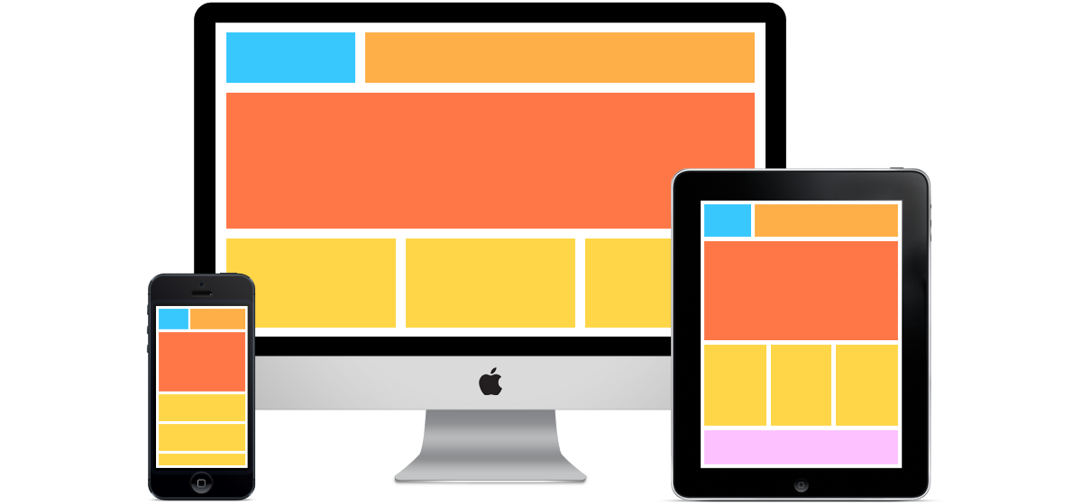
Responsive web design enables a pre-existing website to resize and re-adjust automatically for various mobile devices. Technologies like CSS3 and HTML5 make it easy to design your site to adapt to any device it’s being viewed on, converting the website to a mobile layout for better viewing. Responsive web design is a great option, and growing more popular by the day as the variety of devices that access the web grows. Mashable noted that last year they were accessed on over 2,000 different mobile devices! Responsive design aims to make your site look gorgeous on all of them
Pros
- One single website adapting to different devices, rather than managing separate sites for different devices
- Responsive web design is the Google-recommended method of mobile website design
- Simple, light, and streamlined.
- You don't need to oversee different pages, which can decrease support expense of a site.
Cons
- Sites implementing responsive mobile web design can be slower to load than .mobi sites
- Website ads often break when being adjusted with responsive web design
- Having two domains means the increased possibility of duplicate content
- The normal improvement time of building a responsive site is typically 20% more than

